
Kitchen design trends 2026: what actually changed in our clients' orders
Over two years our clients have started choosing differently. Hob, worktop, front, display cabinet — the same four elements, but they are picked differently than in 2024, and almost always in one direction: anything that cuts a surface in two leaves the kitchen. What became more expensive is not the kitchen as a whole, but a handful of elements inside it.
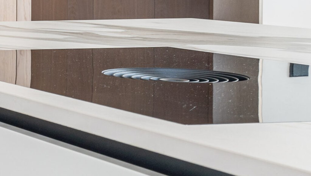
The extractor moved into the hob
The hood above the hob is the first to go. Hobs with a built-in extractor are ordered from us noticeably more often than two years ago, and the reason is not the appliance itself: the hood was the one detail that kept the island from reading as a single volume. It went — and the island can be seen from every side, while the wall above the working area was freed up.
The worktop climbed the wall
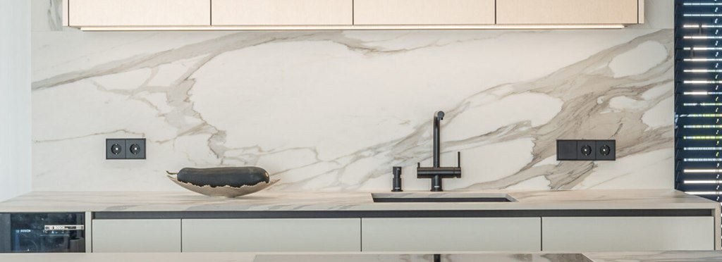
The wall above the worktop came under the same gaze. The worktop and the wall are increasingly made from one material, with no joint at eye level. Houzz surveyed more than 1,700 households who had finished a kitchen renovation, and a continuous panel instead of tiles came out among the year's main changes. There is more stone in the orders, but laminate with a stone décor works too: what decides is not the slab's composition but the fact that the pattern is not cut through.
Painted MDF gave way to Fenix
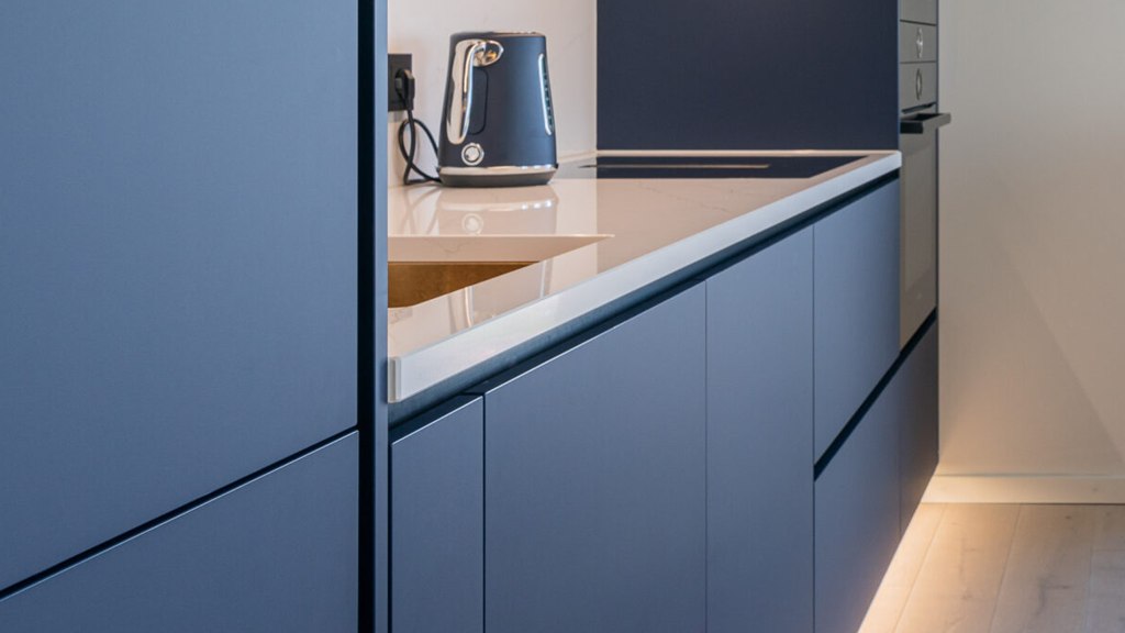
Fronts are changing by the same logic. Painted MDF is chosen noticeably less often, and Fenixtakes its place. Its manufacturer, Arpa Industriale, describes the surface in concrete terms: a deep matt with almost no reflection, fingerprints do not stay, small scratches close under heat. Estonian designers say the same in Postimees, only without the technical part: gloss is leaving, and a grey-and-white kitchen looks tired. That pair holds the whole difference: matt is a mood, Fenix a material with an edge and a price.
The difference shows on the bill, not in the quantity
Each of these swaps costs more than the detail it pushed out. The German trade association AMK counted 1.3 % fewer kitchen orders last year — while the average order value grew by 5.3 %. Kitchens did not start being ordered more often, they started being ordered at a higher price. The money did not go into square metres, but into a few elements you see every day.
Handles disappeared, and not because of fashion
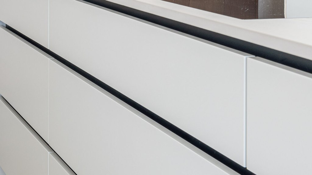
After all that, the handle is left over. The front has become one continuous matt surface, the worktop one continuous panel, and the handle is the only thing cutting that surface. Handles are dropped more and more often, and not only here: at EuroCucina in Milan in 2026 most brands showed handleless fronts, with light set right into the opening profile. Such a front is opened by the profile or by pressing.
The display cabinet came back — now as a light source
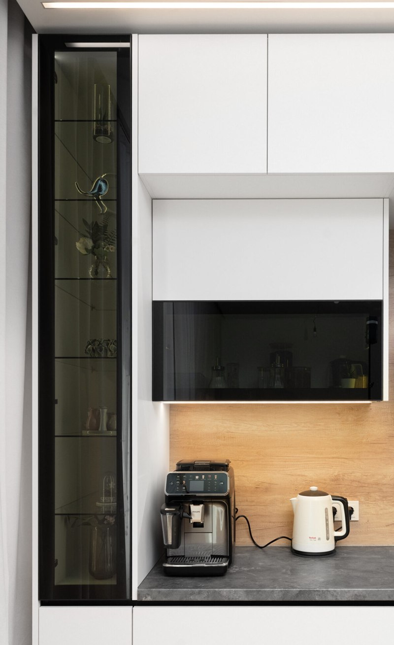
Demand grew most for one element — an aluminium frame with glass and lighting inside. A display cabinet used to be ordered to show the tableware; now it is ordered for the light. Shelf lighting turns the cabinet into a source of light, and on tinted glass that shows best of all. The frame itself goes almost unnoticed: people look at the glass and the light.
Strip gave way to COB
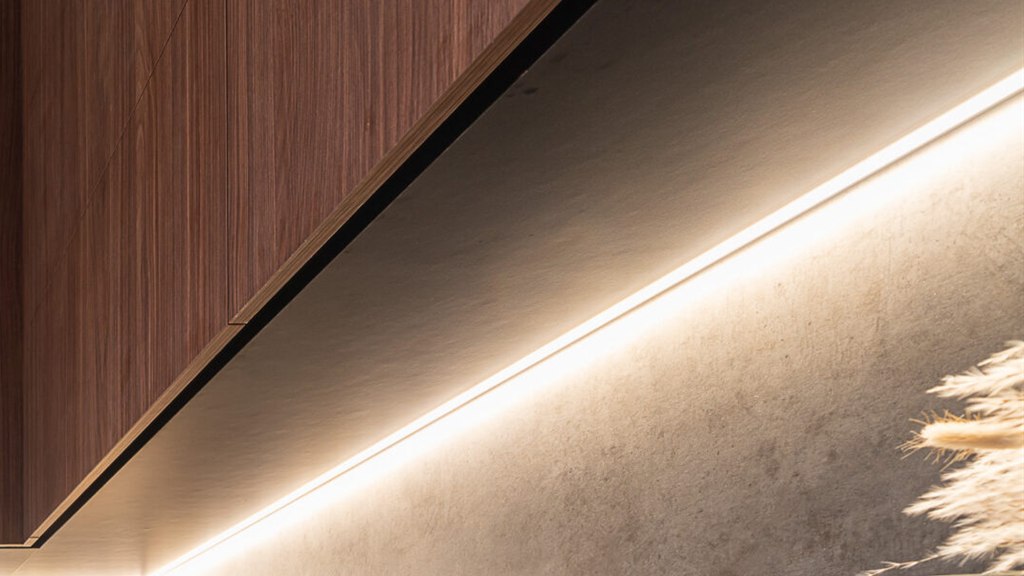
We make the light in such a cabinet differently than two years ago. An ordinary LED strip is a row of separate diodes, and behind glass or on polished stone every point of it shows. We moved to COB: the chips are encapsulated in one continuous line and the dotted look disappears. It shows where the light itself shows — under the wall units and along the edge of the cabinet.
Where that difference gets lost
A client almost always arrives with a list of what they want to add. The same Houzz survey: nearly everyone ordered drawer organisers, three out of four ordered built-in storage. A kitchen with everything put in at once stops reading — expensive elements cancel each other out, and the difference the whole thing was started for disappears. That is why we more often talk clients out of it.
The difference shows where there are few decisions and each one is carried through: one surface, one material on the wall and the worktop, light instead of décor. Kitchens like that stand complete in our projects, and for your own it is enough to send the dimensions.